Oracle Forms Developer and Reports Developer Release 6i:
Guidelines for Building Applications

A73073-01

PrevNext

Contents

Index

2
Designing Visually Effective Applications

This chapter offers guidelines to help you develop a graphical user interface (GUI):

Section  Description 

Section 2.1, "Understanding the Process" 

Briefly describes the process for developing a GUI-based application. (If you've developed GUIs in the past, you may want to go directly to Section 2.1.3, "Planning the user interface"

Section 2.2, "Creating an Effective Form" 

Addresses visual considerations for creating forms. The section begins with a review of basic Form Builder terminology, discusses the importance of object libraries as a means of enforcing standards, and presents guidelines for employing forms objects in your GUI. 

Section 2.3, "Creating an Effective Report" 

Helps you understand how to control the placement of report objects and where page breaks occur. 

Section 2.4, "Creating an Effective Display" 

Presents some visual considerations for graphical representations of your data. 

2.1 Understanding the Process

Even more important than understanding the process for developing an effective GUI is understanding the people who will use it. In fact, your success is directly related to how well you understand your users--the tasks they perform, the order in which they perform them, their surroundings, and their expectations.

If you're like many application developers, this idea may require a profound shift of focus. Applications typically evolve from the inside out: from the datasource itself, to the code, and finally to the GUI. If you are committed to developing an effective GUI, you must reverse this process: first, interview your users; next, design a user interface that supports their specific tasks; and finally, create the underlying code base that makes it all work.

Figure 2-1 Thinking about the user first

No set of prepackaged standards or guidelines can serve as a substitute for developing an accurate understanding of your users' needs. This chapter can help you develop that understanding, as well as assist you in creating an interface uniquely tailored to your particular group of users.

2.1.1 What are the stages?

As shown in the Figure 2-2, the process for developing a GUI consists of four major stages:

Figure 2-2 Stages in developing a user interface

The rest of this section offers guidelines for completing each of these stages:

Note: This chapter is not intended to treat the subject of GUI development exhaustively. If you require more detail on how to proceed in a given stage, you may want to visit your local library or computer bookstore. In particular, Jeffrey Rubin's "Handbook of Usability Testing" is an excellent source of information on defining user requirements and gathering user feedback.

2.1.2 Defining user requirements

In the first stage of GUI development, you determine what the user needs and expects from your application. While it may be tempting to skip this stage and move right to the design phase, it's risky to do so. Without a clear understanding of the users themselves and the tasks they must perform, it is virtually impossible to create an effective GUI.

To define user requirements:

2.1.3 Planning the user interface

In the second stage, you plan and document how you will implement a user interface that meets the users' needs. This involves:

2.1.3.1 Creating your standards

A set of consistent development standards is crucial to the success of any development effort. By developing and enforcing standards pertaining to layout, use, and behavior of various GUI elements, you can ensure that even disparate parts of the application have a common look and feel. Both Forms Developer and Reports Developer offer several mechanisms to assist you in developing a consistent set of standards.

Table 2-1 Standards mechanisms
Mechanism  Description 

Object Library (Form Builder) 

An object library is a set of objects and standards that you create and make available to your entire development team. Through the use of subclassing, each developer can ensure that changes made to the objects in the object library are propagated throughout all applications that use them. Object libraries are the preferred mechanism for standardizing your Form Builder applications.

Form Builder provides two object libraries which you can customize to meet your own site requirements:

  • Standard Object Library, which contains suggested standards optimized for the Windows 95 environment.

  • Oracle Applications Object Library, which contains standards for cross-platform applications: Windows 95, Solaris, Macintosh, and character mode.

For more information, see the Form Builder online help topics "About object libraries" and "About subclassing". 

Object Group (Form Builder) 

An object group is a container for a group of objects. You define an object group when you want to package related objects so you can copy or subclass them in another module.

For example, suppose you build an appointment scheduler using several types of objects, including a window and canvas, blocks, items that display dates and appointments, and triggers that contain the logic for scheduling and other functionality. By packaging these objects into an object group, you can copy all of them to other forms in one simple operation.

For more information, see the Form Builder online help topic "Guidelines for using object groups". 

Visual attributes (Form Builder) 

Visual attributes are the font, color, and pattern properties you set for form and menu objects that appear in your application's GUI. Visual attributes can include the following properties:

  • Font properties: Font Name, Font Size, Font Style, Font Width, Font Weight

  • Color and pattern properties: Foreground Color, Background Color, Fill Pattern, Charmode Logical Attribute, White on Black

For more information, see the Form Builder online help topic "Guidelines for using visual attributes". 

Template (Form Builder, Report Builder) 

In Form Builder, you can create templates to provide other team members with a default starting point for new forms. Templates typically include generic objects, such as graphics (like corporate logos), toolbars, program units, standard window layouts, toolbars, and menus, and other common objects.

Report Builder not only allows you to create your own templates to help control the appearance of your reports, but provides a wide variety of pre-defined templates as well. Using the Report Wizard, you select the objects you want to include in your report, then select a template to arrange those objects and apply standard formatting attributes.

For more information, search the Form Builder or the Report Builder online help index for "templates". 

2.1.3.2 Considering portability

If you intend to deploy your application in more than one environment, it's important to understand how various GUI elements are rendered on each platform and which elements are restricted altogether. For example, due to formatting constraints between platforms, interactive buttons that you create for Windows may shrink and become less readable when displayed on Solaris. Chapter 5, "Designing Portable Applications", helps you understand platform-specific constraints and provides tips and guidelines for working around them. It also provides considerations for character mode, which restricts the UI in numerous ways.

2.1.3.3 Creating a prototype

Prototypes are an extremely effective means for ensuring usability in your application. The most effective prototypes follow an iterative development model, beginning with a storyboard and ending with a fully functional application. The process breaks down as follows:

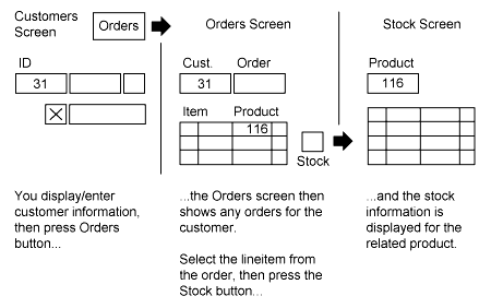
  1. Draft a storyboard to give you a clear picture of how the application will actually look and behave. A storyboard is a frame-by-frame drawing of screens showing transition and appearance. Include a narrative to describe how the screens relate to the tasks you identified when you defined the users' requirements.

    Here is an example of three panels from a storyboard for an ordering application:
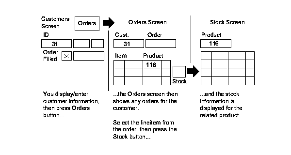

Figure 2-3 Example of a storyboard

  1. Show the storyboard to users. Verify that your planned application addresses their needs and supports their tasks the way they perform them.

  2. Expand the storyboard into a paper prototype. Whereas a storyboard sketches task and window flow at a high level, a paper prototype is a fairly detailed illustration of the entire application. A paper prototype typically contains one piece of paper for each window you've planned, complete with widgets, arrows to represent task flow and navigation, and so on.

  3. Show the paper prototype to users. Most of the organizational issues should have been identified during the storyboard phase, so you can now focus on details: the placement of buttons, the layout of a supporting dialog, and so on. Section 2.1.5, "Gathering user feedback" offers some tips for conducting the session with users.

  4. Based on user feedback, create a functional prototype using Forms Developer or Reports Developer. The following sections can help you select the appropriate objects for your prototype:

  5. Let users experiment with the functional prototype. Be sure to include users who were not involved in the earlier sessions so you can determine whether the application is easily grasped by new users.

  6. Repeat steps 5 and 6 until you are satisfied that you have met all the objectives stated in your user requirements.

2.1.4 Building the user interface elements

Only when you have devoted sufficient time to developing your conceptual model--that is, when you fully understand your users and the tasks they perform and have designed smoothly flowing dialogs in support of those tasks--only then are you ready to begin building your user interface. This chapter contains three sections to help you choose your user interface elements carefully:

2.1.5 Gathering user feedback

When you have developed a working prototype, either on paper or with Forms Developer or Reports Developer, return to the users you interviewed in the first phase and let them experiment with it. To gather user feedback effectively:

Remember: only the actual user of your application is qualified to comment if the UI is appropriate.

After testing the prototype on users and gathering their feedback, return to the build stage, modify the user interface accordingly, then test your changes again. Continue this cycle until the interface meets the objectives you outlined in the requirement definition phase.

2.2 Creating an Effective Form

This section explains how to build an effective GUI using Form Builder.

Note: The information in this section assumes a Eurocentric viewpoint. (If you are developing for a non-Western audience, be sensitive to the cultural background of the users. If practical, have your design reviewed by several members of your target audience.)

2.2.1 Understanding forms

Before addressing specific considerations for forms, it may be helpful to briefly introduce some basic forms concepts. (Experienced Form Builder users should go to Section 2.2.2, "Guidelines for building forms".) For more details on these and other related forms topics, see the Form Builder online help and/or the Forms Developer Quick Tour.

2.2.1.1 What is a module?

When you build an application with Form Builder, you work with individual application components called modules. There are four types of modules in Form Builder:

Module Type  Description 

Form module 

A collection of objects and code routines. Some of the objects you can define in a form module include windows, text items (fields), check boxes, buttons, alerts, lists of values, and blocks of PL/SQL code called triggers.


Menu module 

A collection of menus (a main menu object and any number of submenu objects) and menu item commands.


PL/SQL Library module 

A collection of user-named procedures, functions, and packages that can be called from other modules in the application.


Object Library module 

A collection of objects that can be used to develop applications. See Table 2-1, "Standards mechanisms" for more information.


This chapter does not address the use of PL/SQL library modules. For information on this topic, refer to the Form Builder online help.

2.2.1.2 What are forms, blocks, items, regions, and frames?

Simply put, a form (or form module) is an application that provides access to information stored in a datasource. When you look at a form, you see interface items such as check boxes, radio groups, and so on, which enables the user to interact with the datasource. These interface items belong to a container called a block. In Figure 2-4, the fields Customer ID, First name, Title, and so on all belong to the same block.
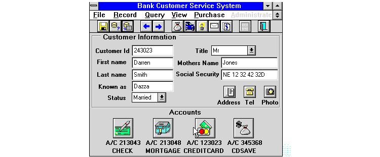
Figure 2-4 Sample form

There are two types of blocks: a data block, which serves as a link between the datasource and the user, and a control block, which is not associated with a datasource. Each data block can enable the user to view and access data from one table in the datasource. Blocks can be single-record blocks, which means that they show one row of data at a time, or multi-record blocks, which enable users to see many rows of data at once. All of the fields in Figure 2-4 are in single-record blocks.

A region is a rectangle or line that separates a logical grouping of fields from others in the block. In Figure 2-4, the rectangle that separates the Customer Information fields from the Accounts icons is a region.

A frame is a pre-defined way of arranging certain items in a block. For example, the block shown in Figure 2-4 was arranged by a frame that established its margins and offsets, the distance between the items and prompts, and so on.

2.2.1.3 What are windows and canvases?

A window is the container for all visual objects that make up a Form Builder application. A single form can include any number of windows; all but the simplest of forms have several windows associated with them. Several types of windows are available:

Window type  Description 

Container (MDI) 

Holds all other windows. It usually, but not always, contains the toolbar and main menu. (Windows only) 

Modeless 

Enables the user to interact with any other window, as well as the toolbar and the menu. Modeless windows are used most often in GUIs when the user is free to choose among many tasks. 

Modal 

Forces the user to work within a single window, then either accept or cancel the changes they have made. The toolbar and menu are not accessible. Use a modal window when the user must complete a particular task before continuing. 

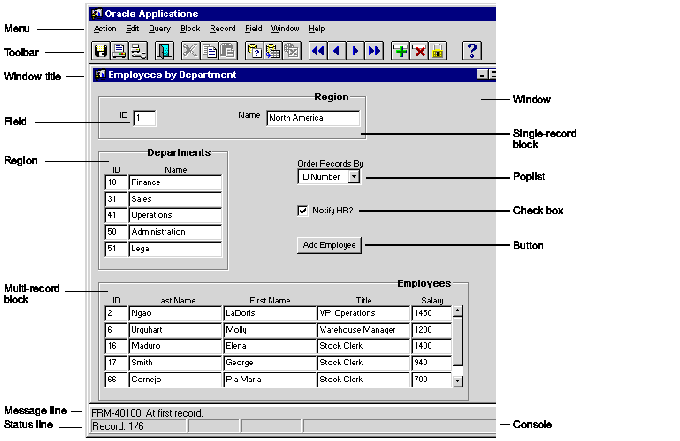
Here is an example of a typical Form Builder window:
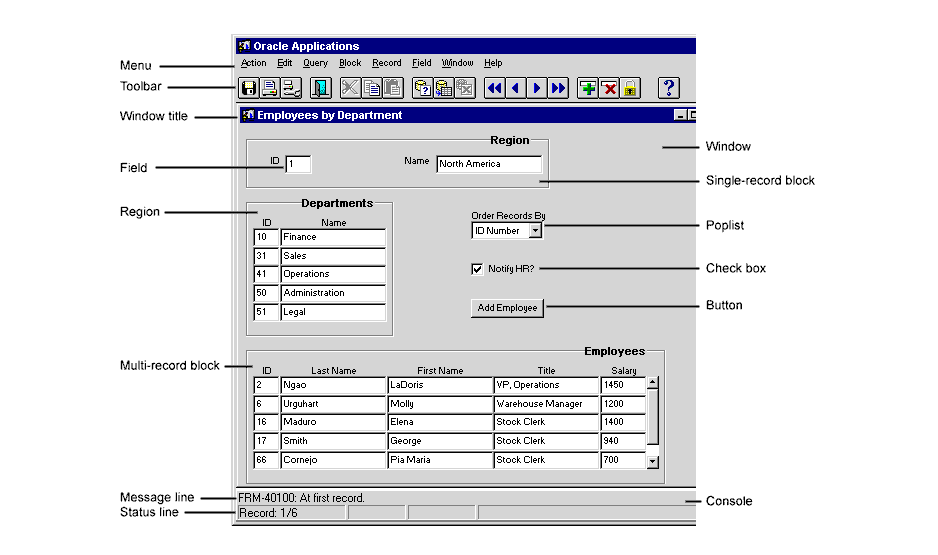
Figure 2-5 Typical Form Builder window

Like most Windows 95 Form Builder windows, this one contains:

A canvas is the background object upon which interface items appear. There are four types of canvases:

Canvas Type  Description 

Content canvas 

Occupies the entire pane of the window in which it is displayed (and possibly more, if the window enables scrolling). Every window has at least one content canvas. 

Stacked canvas 

Displayed atop--or stacked on--the content canvas assigned to the current window. Stacked canvases are useful for conditionally obscuring areas of the content canvas--unpopulated fields, for example. Through the use of viewports you can control how much of a stacked canvas is visible. 

Tab canvas 

A set of tabs that enable you to group and display a large amount of related information on a single dynamic canvas. 

Toolbar canvas 

Used to create toolbars for individual windows. 

Each window may display one or more canvases. You can also conditionally display a canvas in a window, depending on whether certain conditions are met.

2.2.2 Guidelines for building forms

The following sections offer specific recommendations for building an effective GUI with Form Builder:

2.2.2.1 Using object libraries

Perhaps the most important means of standardization available to you as a form developer is the object library. An object library is a set of objects and standards that you create; each object or standard can determine the appearance and layout of an entire frame, window, or region. When housed in an object library, these objects become available to all the developers on your project or site, thus ensuring that even developers working at different locations can produce an application--or different modules within the same application--with a common look and feel. Through the use of subclassing, each developer can ensure that changes made to the objects in the object library are propagated throughout all applications that use them.

A good strategy for using object libraries is to create a separate one for each logical grouping of standards. For example, you may want to have one object library for corporate standards that you make available company-wide, and another tailored for the specific needs of your project.

To help you get started building your own object libraries, Form Builder provides two samples:

Before you create your object library, it's a good idea to test the contents of the Standard or Oracle Application Object Libraries to see what works well and what you need to modify.

To test:  Do this: 

The items in the Standard Object Library in a data block 

  1. Use the Data Block Wizard to create a data block.

  2. Click an item in your control or data block, then click the right mouse button. A list of Smart Classes applicable to that item is displayed; click the SmartClass you want.


The items in the Standard Object Library in a control block 

  1. Open STNDRD20.OLB.

  2. Drag and drop the item(s) into the block.


Only the visual attributes in the Standard Object Library 

Open the STNDRD20.OLB template form. 

The objects in the Oracle Application Object Library 

Open the APPSTDS.OLB template form. 

If you use the Standard Object Library, be sure to subclass all the attributes under the VAGs tab to the Visual Attributes node in your form. Many of the standards are based upon these visual attributes and will not display correctly if the visual attributes are not applied. By subclassing (rather than copying) the visual attributes, you ensure that you always have access to the latest definitions.

If you know that you will be using a particular set of visual attribute groups in all or most of your forms, create a template form that already contains the visual attribute groups subclassed from the standard object library. Then you can name this template when prompted by the Layout Wizard.

For more information on the object libraries, see the help topics "Standard Object Library" and "Oracle Application Object Library" under "Reusable Components" in the Forms Developer Demos online help.

2.2.2.2 Understanding basic design principles

Here are some general guidelines for building forms:

2.2.2.3 Adding color

2.2.2.4 Creating canvases

The following table presents recommendations for creating canvases.

Table 2-2 Recommendations for creating canvases
Canvas Type  Recommendation 

General 

  • Provide plenty of white space between items and regions.

  • Consider placing optional information on separate canvases.

  • Avoid scrolling windows, if possible. Studies have shown that productivity decreases sharply when the user has to scroll a window to complete a task.

  • Plan separate windows for canvases that need to be viewed concurrently.

  • Although your planned layouts may fit comfortably on a monitor using Super VGA mode, they may scroll off-screen in different resolutions, like VGA. Test your layout on all your users' monitors.


Content canvas 

  • Set content canvases to Display immediately.

  • Remember that the view size for a content canvas is determined by the current size of its assigned window.

  • Consider using non-white canvases so that the bevel effects of objects on the canvas are maximized. In addition, white backgrounds are often so bright that they can be tiring.

  • Use one content canvas per window. Using more than one can be confusing if the user does not understand why the entire window is being replaced. If you do use more than one content canvas, make sure they are logically related, and require the user to move between them explicitly. One successful implementation of multiple content canvases is a word processing application in which the user chooses between several views of the same document: print preview, normal, and outline.


Stacked canvas 

  • Use stacked canvases to hide and display groups of objects, including boilerplate.

  • Size the stacked canvas only large enough to contain the necessary items.

  • Be sure you know how stacked canvases behave before you implement them. For example, if the user uses Next Field or Next Record to navigate to a field that is obscured by a stacked canvas, the stacked canvas seems to disappear--that is, it is automatically placed beneath the content canvas. To re-display the stacked canvas, users must either navigate to an item on the stacked canvas or navigate away from the stacked canvas and select the Show Canvas action.


Tabbed canvas 

  • Limit the number of tabs to 4-6.

  • Use tabs to organize related information about a single object. For example, employee information such as salary, benefits, and job description might work well as a tabbed dialog.


2.2.2.5 Creating windows

The following table presents recommendations for creating windows.

Table 2-3 Recommendations for windows
Attribute  Recommendations 

General 

  • Do not use bevels around the edge of the window.

  • Inherit color settings from the environment.

  • Leave the top and bottom lines of the window blank, except for buttons and coordination check boxes.

  • Leave the left and right edge character cell columns blank, except for region lines and block boundary lines.

  • Use modeless (non-modal) windows to allow scrolling, and for "leave and come back" navigation (use the STD_DIALOG_WINDOW_MODELESS object in the Standard Object Library).

  • Use modal windows to prevent mouse navigation elsewhere and for dependent tasks that are part of a procedure (use the STD_DIALOG_WINDOW_MODAL object in the Standard Object Library).


Title 

  • Title each window in a form uniquely so that iconified names and entries in the Windows menu are significant.


Position 

  • Make sure each window is fully visible when it is first opened.

  • Make all windows moveable.

  • Retain window positions when a form is exited.


Scrollbar 

  • Design your windows so that scrolling is not required by default. Scrolling is acceptable only when provided as a result of the user re-sizing the window.


Toolbar 

  • Place the toolbar only on the container window (on Windows) or the root window (on all other platforms).

  • Provide hints for the toolbar buttons in tooltip help displayed just beneath each button as the mouse passes over it. (See Section 2.2.2.9.1, "Implementing Tooltips".)


2.2.2.5.1 Choosing a title for modeless windows

While the STD_DIALOG_WINDOW_MODELESS object in the Standard Object Library addresses all issues pertaining to positioning, closing, resizing, and placement, you still have to choose your own title. When doing so:

2.2.2.6 Creating regions

The following table presents recommendations for creating regions

Table 2-4 Recommendations for regions
Attribute  Recommendation 

General 

  • Avoid creating regions or adding boilerplate lines to group items unless doing so is meaningful to the user and improves the usability of the screen.

  • Make the line or rectangle creating the region black, with an inset bevel.

  • Use a frame for regions containing an entire block. A frame has properties that control the layout of the items within it, such as the space between the frame and items (margin), spacing, and visual attributes. Using standard frames ensures the consistency of your window layout. (Although the Layout Wizard creates a frame, you can always override it by applying a frame stored in your object library.)


Title 

  • Add a title to the region unless the information contained within is obvious. Use boldface.

  • Position the title on top of the rectangle or line, leaving one leading and one trailing space in the title text.

  • To display the title, use one of these widgets:

Boilerplate (for static region titles)Frame title (for frames)Display item, designed to look like boilerplate (for dynamic region titles)Poplists (for alternative regions)Check boxes (if an entire region is applicable or non-applicable) 
.

2.2.2.7 Adding items to blocks

The following table should help you decide when to choose one form item over another. It also presents some guidelines that you can use if you decide to modify an object or standard in the Standard Object Library. The items are presented in alphabetical order.

Table 2-5 Recommendations for items
Item  When to use  Recommendations 

Boilerplate text 

  • Use for text that is neither a prompt nor a title.

 
  • Use mixed case.

  • Avoid overuse of italics and underlining.

  • Use font styles consistently. For example, if you use bold for emphasis, do not use bold for any other purpose.

  • Avoid excessive variations of fonts, sizes and colors.


Buttons (non-iconic) 

  • Use as dialog responses (in modal windows) and for item-related actions.

 
  • Use one of the STD_BUTTON_type objects in the Standard Object Library.

  • Limit six to a window. Arrange in a single row, if possible, or a single column.

  • Align buttons, leaving 0.1" space between them. Separate logical groupings of buttons by 0.5".

  • Leave 0.1" between the right edge of the rightmost button and the right edge of the window.

  • Capitalize label words; for example, `Print Invoice'.

  • Use an ellipsis (...) at the end of a button label if the button opens a modal window or if the user must provide more information about the action in another window (modal or not) before the action can be completed.

  • Place OK and Cancel buttons together.

  • Put affirmative and cancellation buttons first, unique buttons last.

  • Use chevrons (>>) to indicate that the dialog will be expanded.

  • For labelled buttons (except OK and Cancel), always provide an accelerator key (underlined letter).

Use the first letter of the first or second word in the label ("F" for "File" or "P" for "Start Posting"). If a stronger link exists (like "X" for "Exit"), use that letter.Use consonants instead of vowels when possible.Make access keys unique within a window. Ensure they do not conflict with the keys used by the top level of the menu. 

Check boxes 

  • Use only when the label on the check box can clearly be thought of as having "true" (checked) and "false" (unchecked) states. Otherwise, use a radio button group with two items.

 
  • Use the STD_CHECKBOX object in the Standard Object Library.

  • Use positive statement labels:

Not good: Don't show this alert in the future.Better: Show this alert in the future. 

Display items 

  • Use for display-only fields in which the user can never type; for example, the Total field in a financial application.

 
  • Use the STD_DISPLAY_ITEM object in the Standard Object Library.


Icons 

  • Use only for frequent or critical actions.

  • Use where a picture conveniently conveys a task or mimics a real-world object.

 
  • Place frequently used buttons on a toolbar.

  • Group related tools together and separate groups with white space.

  • Disable buttons that are unavailable.

  • Always provide tooltips, as users are often confused by the meaning of icons.

  • Icons are often cultural. Be aware that you may need to translate them.

  • Avoid "visual puns", such as a running figure for "Run". Their meanings are not obvious, and will certainly not be understood in other languages.


Lists (see also Poplists and T-Lists) 

  • Use when it is easier for the user to select a value than to type in a value.

  • Use for data entry and display of text values in a selectable list format.

  • Use when displayed value entries are relatively short (up to 30 characters each).

  • Use the combo-box style if the user may enter new values.

 
  • For 15 entries or less, use a poplist. For more than 15 entries, use an LOV (List of Values). For more than 30 entries with a lot of real estate, use a T-List.

  • Make all related fields the same length.

  • Use the color of the canvas background for text items that have become non-enterable.


LOVs 

  • Use when the user must select from a list of more than 15 rows or to show several columns of data.

 
  • Automatically select a row for the user when there is only one valid value.

  • Move the cursor automatically to the next field after a selection is made.

  • If there are more than 100 rows in the LOV, prompt the user to reduce the list of valid values before making a selection.


Poplists 

  • Use when only one value is applicable and the list of choices is 15 or less.

 
  • Before implementing a poplist, consider whether frequent users can type faster than they can select.


Pop-up menus 

  • Use to associate menu options with an item, rather than the whole application.

  • Use to provide access to frequently used commands.

 
  • Use the STD_POPUP_MENU_ITEM object in the Standard Object Library.


Prompts 

  • Use as labels for fields, check boxes, lists, etc.

 
  • Place toward the top or left of the element they are describing.

  • Always place single-record blocks prompts to the left of the field and multi-record block prompts above the field.

  • Use the terms "From" and "To" to identify fields involved in a range rather than "Start" and "End" or "Low" and "High".

  • For percentages, place the percent sign (%) after the field. Do not include it in the prompt.


Radio groups 

  • Use to present mutually exclusive choices.

  • Use to set a `mode', such as what type of information will be displayed.

 
  • Use the STD_RADIO_GROUP object in the Standard Object Library.

  • Use vertical orientation instead of horizontal.

  • Group related buttons into radio groups with a title.

  • If the choices are binary (ON/OFF, YES/NO), use a check box instead.

  • Always provide a default value.


T-Lists 

  • Use only when one value is applicable and the list of choices is never expected to grow beyond 30.

 
  • Always show at least five rows of data.

  • Use only in forms with a lot of available real estate.


Text items 

  • Use for data entry and display of character values.

  • Use for lengthy or unprepared values (that is, those that do not appear in a short, pre-defined list).

 
  • Use the color of the canvas background for text items that have become non-enterable.

  • Use a bevel if the user can enter values in the field.

  • Use the STD_TEXT_ITEM or one of the STD_DATE_type objects in the Standard Object Library.


2.2.2.8 Designing messages

Messages are shown either in the window console area or in popup windows called alerts. How you display messages depends upon their type and whether a reply is required by the user. Here are some suggestions:

Table 2-6 Displaying messages
Message Type  Recommendations  Example 

Errors 

  • To present an error message, use the STD_ALERT_STOP object under the Alerts tab in the Standard Object Library.

  • Use when an error is serious enough to halt processing. Include a stop sign icon in the dialog.

  • Use sparingly.


"You do not have sufficient authority to approve this Order." 

Warning 

  • Use the STD_ALERT_CAUTION_1, STD_ALERT_CAUTION_2, or STD_ALERT_CAUTION_3 objects under the Alerts tab in the Standard Object Library. While in the Library, click the object once to see a description of the message text.

  • Use to present a question that the user must respond to before processing continues. Include a yield sign icon (!) in the dialog.

  • Keep the warning short and concise. For example, use "Delete this order?" rather than "Do you really want to delete this order?"

  • Phrase questions positively ("Save changes?" rather than "Are you sure you don't want to save changes?")


"Copy all lines on this invoice?"  

Information 

  • Use the STD_ALERT_INFORMATION object in the Standard Object Library.

  • Use to present messages that the user must acknowledge when no choice is involved. Include the information icon (the letter "i" in a circle) and the OK button.


"Line and Shipment Quantities currently do not match."

"There are items awaiting your attention." 

Hints 

  • Appears on the Form Builder message line in the Console.

  • Use to present messages of very little consequence, or process indicators that do not require a response.


"Working..."

"At first record."

"Processed Order line 12 of 37." 

2.2.2.8.1 Creating Message Text

If possible, error messages should include:

Here are some examples of bad and good message text:

Bad  Good 

Invalid Date 

"Please re-enter the date as DD-MON-YY." 

Do not enter a start date later than the ending date 

"The start date must be earlier than the end date." 

Error: 1623, constraint violation 

"Please re-enter a unique value for this field." 

You should not receive this message 

Don't display the message at all. 

Tool lost at sea 

Replace it with an appropriate message or take it out altogether 

When writing message text, try to adhere to these guidelines:

Recommendation  Example 

Use active voice. 

"Do this now", not "This will need to be done"  

Use imperative voice. 

"Enter a commission plan", not "You can enter a commission plan"  

Use "can" instead of "may" or "could". 

"You cannot delete a printed release", not "You may not delete a printed release"  

Refer to actual field names when possible. 

If a field is labelled "Sales Associate", don't use the message "Please enter a different salesperson". 

Use uppercase for commands and keywords. 

ALTER CLUSTER statement is no longer supported." 

Avoid the use of humor. 

You made a boo-boo! 

Avoid accusatory messages. Do not insinuate that the user is at fault. Do not mention the user's mistake unless it pertains to the problem's solution. 

Instead of "You didn't choose a value", try "Please choose a value". 

When a message contains instructions, use "please". 

"Please choose a value" is preferred over "Choose a value". 

Address the user as "you", not "the user". Avoid using "I", "He", or "She". 

Instead of "The user should back up his modules", try "Please back up your modules". 

Consider providing context-sensitive help when errors occur. 

See Section 2.2.2.9.2, "Implementing Online Help"

2.2.2.9 Implementing online help

This section discusses using two types of online help:

Tooltips Also known as popup hints and microhelp. Displayed when the user moves the mouse over an item on the screen.Online Help Contains context-sensitive help and hypertext links that enable users to jump to related topics.
2.2.2.9.1 Implementing Tooltips

Each item has a property called Tooltip and another called Tooltip Visual Attribute Group. In the Property Palette's Tooltip property field, enter the text you want to display in the pop-up. To ensure consistency across your application, apply the STD_TOOLTIP visual attribute from the Standard Object Library. If you don't apply a visual attribute, the tooltip uses a platform-specific default.

2.2.2.9.2 Implementing Online Help

2.2.2.10 Building effective menus

Form Builder provides a default menu for every form. The default menu includes commands for all basic database operations, including querying, inserting, and deleting. If your application has specific requirements not met by the default menu you can quickly create a custom menu. (See "Creating a menu" in the Form Builder online help for instructions.) While building a menu, keep the following ideas in mind:

2.3 Creating an Effective Report

The first steps in using Report Builder to design an effective report are the same as those for designing an effective form or display. Before reading the rest of this section, it's a good idea to read Section 2.1.2, "Defining user requirements", if you haven't already.

Here are a few questions to help you determine the user requirements for your report:

2.3.1 Understanding Reports

Before addressing specific considerations for reports, it may be helpful to briefly introduce some basic reports concepts. (Experienced users of Report Builder should skip this section.) For more details on these and other related reports topics, see the Report Builder online help and/or the Report Builder section of the Reports Developer Quick Tour.

When you build a report, you work with two application components:

Module Type  Description 

Report module 

A collection of objects and code routines. Some of the objects you can define in a report module include repeating frames, frames, fields, boilerplate, anchors, and blocks of PL/SQL code called triggers. 

PL/SQL Library module 

A collection of user-named procedures, functions, and packages that can be called from other modules in the application. 

This section does not address the use of PL/SQL libraries. For information on this topic, refer to the Report Builder online help.

For some reports, you will use the Report Wizard (to choose a report type, define a data model, and a layout for the data) and the Report Editor's Live Previewer (to fine-tune the report). For other reports, you will use other views of the Report Editor:

View  Used to: 

Data Model view 

Create a report with more than one query. 

Layout Model view 

  • Create reports with multiple sections (e.g., a single report with a tabular and matrix style)

  • Add new layout objects (e.g., buttons)

  • Control how objects are sized or positioned


Parameter Form view 

Present users with a dialog in which they can specify parameter values before running the report. 

Because this chapter discusses how to create visually effective applications, the remainder of this section focuses on using the templates, objects, and settings found in the Layout Model view.

2.3.2 Using Templates in Report Builder

Perhaps the most important means of standardization available to you as a report developer is the template. A template is a collection of boilerplate objects, and layout and report settings that determine the appearance of an entire report. Several templates are shipped with Report Builder, and you can create your own. By creating corporate or group templates and making them available to your entire development team, you can ensure a common look and feel. For instructions on how to create a template, see the Report Builder online help.

2.3.3 Understanding Layout Objects

The Layout view of the Report Editor may contain the following objects:

Object  Description 

Frames 

Containers that control repeating frames, fields, boilerplate, buttons, and child frames. Unlike Form Builder frames, Report Builder frames do not have formatting properties that control the location of child objects. 

Repeating frames 

Containers that control:

  • Fields containing report data

  • Other objects owned by the repeating frame


Fields 

Containers that display the report data, dates, page numbers, and so on. 

Boilerplate 

Text or graphics that appear as often as required by the object that surrounds it (the report, frame, or repeating frame), or to which it is attached. 

Anchors 

Objects that determine how two objects in a report layout relate to one another (i.e., parent/child relationships and relative positioning). 

Buttons 

Objects that perform an action when users click on them. 

With the exception of anchors, layout objects may have format triggers, such as PL/SQL blocks that are invoked each time the object is activated.

2.3.4 Controlling Layout Objects in Report Builder

When designing a report, remember that the size of the entire report and the size of many of its individual objects may vary, which can affect pagination in a printed report. Consider a report based on this query:

select ename, sal from emp
where sal > 2000

The size of this report and its objects is based on several factors:

Instances of the same object may also vary in size. For example, suppose you have a VARCHAR2 column in the database called COMMENTS. For one record, COMMENTS might contain two sentences. For another, it might contain 10 sentences. The size of the field in your layout that corresponds to the COMMENTS column must then be able to accommodate values of different length. In addition, objects around that field may have to be "pushed" or "pulled" to avoid being overwritten or leaving large gaps in the report.

Fortunately, Report Builder provides a variety of mechanisms in the Layout View of the Report Editor that enable you to control how objects are sized and positioned. These mechanisms are described in the following sections:

2.3.4.1 Using anchors

Anchors determine how objects in a report layout relate to one another. When two objects are anchored together, one object is considered the parent and the other the child. By defining parent-child relationships between objects, anchors establish a hierarchy for the objects in a report. Based on this hierarchy of objects, Report Builder decides how objects should be printed in relation to each other, whether it should attempt to keep the two objects on the same page, and how objects should be pushed or pulled depending on the size of surrounding objects.

Anchors can be created in one of two ways:

2.3.4.2 Using the Print Object On and Base Printing On properties

The Print Object On property determines the frequency with which an object appears in a report. The Base Printing On property specifies the object on which to base the Print Object On property.

For example, if you specify a Print Object On of All Pages and a Base Printing On of Anchoring Object, the object is triggered to print on every logical page on which its anchoring object (parent object) appears. Objects created by the Report Wizard have these properties set for them. In most cases, the values that Report Builder chooses are the best ones for the object. The only time you should need to set these properties yourself is when you want to override the default value set by Report Builder.

In applying the Print Object On property, Report Builder considers the first page of an object to be the first logical page on which some part of the object is printed. Likewise, the last page is considered to be the last logical page on which some part of the object is printed. For example, if you specify a Print Object On of First Page and a Base Printing On of Enclosing Object, the object will be triggered to print on the first logical page on which its enclosing object appears.

Notes:

For more information, refer to the Report Builder online help, index entries: Print Object On and Base Printing On.

2.3.4.3 Understanding Horizontal and Vertical Elasticity

The Horizontal and Vertical Elasticity properties determine how the horizontal and vertical sizes of the object may change at runtime to accommodate the objects or data within it:

Objects created by the Report Wizard have these properties set for them. In most cases, the values that Report Builder chooses are the best ones for the object. The only time you should need to set these properties yourself is when you want to override the default value set by Report Builder.

Different elasticity settings can produce unexpected results in the output. For example, if an object with variable horizontal elasticity contracts, all objects to the right are moved to the left, since these objects are implicitly anchored to the variable object.

For more information, refer to the Report Builder online help, index entries: Horizontal Elasticity and Vertical Elasticity.

2.3.4.4 Using the Page Break Before and After property

Unlike word processing documents, reports and their objects can vary in size and position at runtime. As a result, page breaks in a report can be difficult to predict.

For more information, refer to the Report Builder online help, index entries: Page Break Before and Page Break After.

2.3.4.5 Using the Page Protect property

Use the Page Protect property to try to keep the entire object and its contents on the same logical page. If the contents of the object cannot fit, they are moved to the next logical page. Note that this does not necessarily mean that all the objects below the object with Page Protect set will move to the next page. If one of the objects below can fit on the page, it might print above the object which has Page Protect set.

For more information, refer to the Report Builder online help, index entry: Page Protect.

2.3.4.6 Using the Keep with Anchoring Object property

Use the Keep with Anchoring Object property to keep an object and the object to which it is anchored on the same logical page. If the object, its anchoring object, or both cannot fit on the logical page, they are moved to the next logical page.

If you set Keep with Anchoring Object for a repeating frame, the first instance of the repeating frame must be able to fit on the same page as its anchoring object. Otherwise, the Keep With Anchoring Object condition is not satisfied. If you set Keep With Anchoring Object to Yes for any layout object other than a repeating frame, the object must be able to format entirely on the same page as its anchoring object.

The anchor between the two objects may be explicit or implicit. Consequently, Keep With Anchoring Object may have an effect even if you have not explicitly created an anchor between two objects.

2.4 Creating an Effective Display

Graphics Builder enables you to produce displays for inclusion in both forms and reports. A display can be an application by itself, or included in a form or report.

Use displays when you want to:

When creating graphics, keep the following guidelines in mind:

2.4.0.7 Choosing the Right Graph

Here are some guidelines for implementing the most commonly used displays:

Table 2-7 Recommendations for displays
Display type  When to use:  Recommendations 

Bar graph 

Showing relationships between discrete objects and their related values. 

Limit bars to 20-25. 

Pie chart 

Showing part-to-whole relationships. Typically used to show percentage values. 

Limit slices to 10. 

Line chart 

Show the cumulative effect of continuous data. 

Limit lines to 6-8. 

Double-Y 

Comparing data within a large range of values. 

Limit plots to 4 or less. 

Gantt 

Scheduling and date duration data. 

Limit bars to 40-50. 

High-low 

Displaying daily temperature values, stock market values, and similar data tracking high, low, and current values. 

Limit rows to 30 or less. 

Mixed 

Comparing actual values (bar) to projected values (line). 

Limit rows to 30 or less. 

Scatter 

Showing relationships between numeric data on the X and Y axis. 

Limit rows to less than 50 per inch. 


Prev Next
Oracle
Copyright © 2000 Oracle Corporation.

All Rights Reserved.

Contents

Index